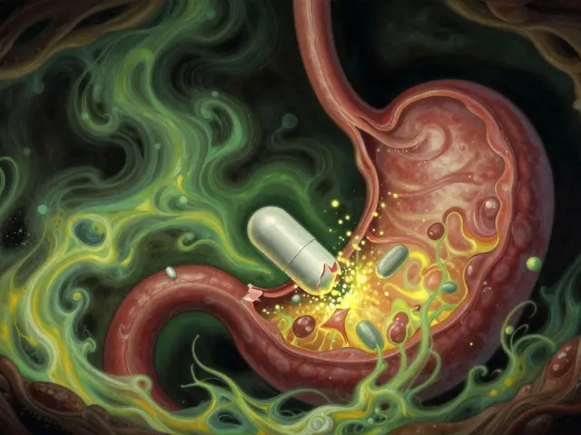
Every time you pick up a prescription, there’s a small sticker on the bottle. Maybe it’s yellow. Maybe it says "May cause drowsiness" or "Take on empty stomach". You might glance at it, nod, and put it in your bag. But what if you got it wrong? What if that little symbol meant something completely different than you thought?
Pharmacy warning icons aren’t just decoration. They’re a last line of defense against dangerous mistakes. In the U.S., medication errors kill at least 7,000 people every year - and a big chunk of those come from misreading these labels. The good news? Standardized symbols have cut certain errors by nearly a third. The bad news? Nearly one in three patients still misunderstand them. And that’s not because people aren’t trying. It’s because the system is broken.
What Do Those Colors and Symbols Really Mean?
Most people assume the color tells the whole story. Red means danger. Yellow means caution. White or green? Just a suggestion. That’s what 42% of patients believe, according to a 2019 study in U.S. Pharmacist. But that’s not how it works - not really.
In the U.S., there’s no national color code. CVS uses 14 different warning labels. Walgreens uses 17. Independent pharmacies? Some use over 20. A yellow sticker at one pharmacy might mean "Take with food". At another, it might mean "Avoid alcohol". The same symbol, different meaning. That’s not safety - that’s confusion waiting to happen.
Even the symbols themselves aren’t always clear. The FDA found that 68% of people with low health literacy think a radioactive symbol (a circle with three curved lines) means "This is dangerous" - not "Use only on skin". One Reddit user described how their mother took eye drops orally because the dropper icon looked like a drinking glass. That’s not a user error. That’s a design failure.
Why the U.S. System Is So Messy
Unlike the UK, which has just nine standardized warning labels used nationwide since 2015, the U.S. has no federal rule. That means every pharmacy chain, every pharmacy software vendor, every pharmacist makes their own call. The result? A patchwork of symbols that change depending on where you fill your prescription.
Compare that to New Zealand. Since 2018, every pharmacy there uses the same small yellow sticker system. The same text. The same symbols. And guess what? Patient comprehension is 22% higher than in the U.S. Why? Because consistency builds trust. When you see the same warning every time, your brain learns it. In the U.S., you’re constantly relearning.
Even the text on labels is a problem. The FDA requires warnings to be written at a first-grade reading level. But a 2019 study found that 91% of patients misunderstood "For external use only". Why? Because they thought it meant "Don’t use it inside" - not "Don’t swallow it". That’s not a literacy issue. That’s a wording issue.
What Happens When You Get It Wrong
It’s not just about confusion. It’s about real harm.
The ISMP documented 187 incidents between 2019 and 2022 where people misread "Do not operate heavy machinery" warnings on sedating medications. Twenty-nine of those led to car accidents. Another study found that 57% of patients thought "Do not chew or crush" meant "Don’t swallow it" - so they spit out their pills. That’s not compliance. That’s dangerous.
Consumer Reports found that 52% of Americans misinterpret at least one common warning. That’s over half. And it’s not just older people. Younger patients, even ones who are tech-savvy, get tripped up. A 2022 Pharmacy Technician Forum thread had 143 stories. The most common? "Take with food" being mistaken for "Only take during meals". People skipped doses because they thought they had to wait for dinner - even if they took the pill at 8 a.m.
What’s Being Done to Fix It
Change is coming - slowly.
In September 2022, the FDA released draft guidelines proposing 12 standardized warning icons to be used nationwide by 2026. CVS and Walgreens have already said they’ll cut their labels down to match. That’s a start. But it’s not enough.
Some pharmacies are testing new tools. Kaiser Permanente tried augmented reality labels. Patients scanned the sticker with their phone and got a 30-second video showing how to take the pill. Comprehension jumped from 58% to 89%. That’s huge. But what about the 24% of seniors who don’t use smartphones? Or people without data plans? Or those who can’t afford a new phone?
Meanwhile, AI is being tested at the University of Pittsburgh. It looks at your age, your other meds, your history, and customizes your warning label. For someone on blood thinners and a sedative, it might highlight "Avoid alcohol" in bold. For someone with kidney disease, it might emphasize "Do not take with NSAIDs". It’s personalized. It’s smart. But it’s still experimental.
What You Can Do Right Now
You don’t have to wait for the system to fix itself. Here’s what works:
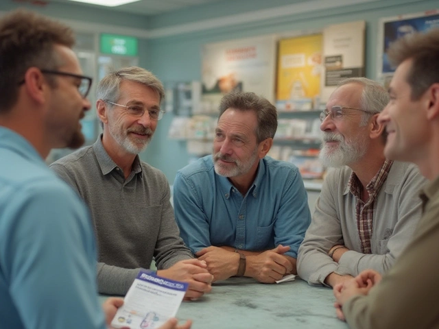
- Ask the pharmacist. Don’t just take the label. Say, "Can you explain what this means?" Pharmacists are trained to do this. They want to help.
- Read the text, not just the symbol. The symbol is a shortcut. The words are the truth. If it says "Take on empty stomach", that means no food for two hours before and after. Not "Take before breakfast".
- Use a pill organizer. Write the instructions on the box. If the label says "Take twice daily", write "8 a.m. and 8 p.m." on the compartment.
- Bring a list of all your meds. Sometimes a warning isn’t about one pill - it’s about the mix. A drug that’s safe alone can be deadly with another.
- Use the ISMP’s free tool. Go to ismp.org and search for their "Medication Safety Self-Assessment". It’s a 10-minute quiz that shows you common mistakes and how to avoid them.
Why This Matters More Than You Think
Medication errors cost the U.S. healthcare system $21.3 billion every year. That’s money spent on hospital trips, ER visits, and long-term care that could’ve been avoided. But beyond the money, it’s about trust. When you don’t understand your own medicine, you start to fear it. You skip doses. You stop taking it. You avoid refills.
And that’s the real danger. Not the symbol. Not the color. Not even the text. It’s the silence. The assumption that you got it right. The quiet nod when the pharmacist says, "Just take one a day." And then you go home and wonder why you feel worse.
The warning icons are supposed to help. But they’re only as good as the people who use them - and the system that designs them. Until we fix the inconsistency, the poor wording, and the lack of follow-up, they’ll keep failing. Not because you’re careless. But because the system wasn’t built for you.
Why do pharmacy warning labels look different at every pharmacy?
Because the U.S. doesn’t have a national standard. Each pharmacy chain - CVS, Walgreens, independent shops - uses its own set of symbols. CVS uses 14, Walgreens uses 17, and small pharmacies often use over 20. This creates confusion because the same symbol can mean different things depending on where you fill your prescription.
What does a yellow sticker on my pill bottle mean?
There’s no universal meaning. In some places, yellow means "May cause drowsiness". In others, it means "Take with food" or "Avoid alcohol". The color alone doesn’t tell you anything. You must read the text. In countries like New Zealand, yellow stickers are standardized - but not in the U.S.
Can I ignore a warning label if I’ve taken this medicine before without problems?
No. Medications can interact differently over time, especially if you start taking a new drug, change your diet, or your health changes. A warning like "Do not drink alcohol" might not have mattered last year - but if you’ve started a new blood pressure pill, it could now be dangerous. Always read the label each time.
What should I do if I don’t understand a warning?
Ask your pharmacist. Don’t guess. Say: "Can you explain what this means?" Most pharmacists are trained to explain warnings clearly. You can also call the pharmacy later if you forget. The ISMP offers a free online tool called the "Medication Safety Self-Assessment" to help you understand common warnings.
Are digital warnings (QR codes, apps) better than paper labels?
They can be - but only for some people. A pilot study showed QR codes that link to short video instructions improved understanding from 58% to 89%. But 24% of seniors don’t use smartphones regularly. If you’re not comfortable with tech, stick with the paper label and ask for a verbal explanation. Digital tools shouldn’t replace clear, simple printed warnings - they should support them.


James Roberts
So let me get this straight - we’re telling people to read labels that change from pharmacy to pharmacy, using symbols the FDA admits 68% of folks misunderstand, and then acting surprised when someone takes eye drops orally? 🤦♂️ We’ve built a system that rewards confusion and punishes the sick. This isn’t negligence. It’s systemic malpractice dressed up as ‘tradition.’
Caleb Sciannella
The lack of standardization in pharmaceutical labeling is not merely an operational inefficiency; it is, in fact, a profound failure of public health infrastructure. The United States, despite its technological prowess and medical innovation, continues to permit a fragmented, decentralized approach to patient safety warnings - a phenomenon that directly contravenes the principles of evidence-based design. Comparative data from New Zealand, where a unified iconographic system has demonstrably improved comprehension by 22%, underscores the viability of a national standard. Until federal regulatory bodies enforce uniformity, we are perpetuating a preventable crisis.
Freddy King
You think this is bad? Wait till you find out half these warnings are written by interns who got stuck in the pharmacy software department. I worked at a CVS for three years. The system auto-generated labels from a template. Someone typed ‘take with food’ and hit enter. The icon? A fork and knife. But at Walgreens? Same icon meant ‘avoid dairy.’ No one checked. No one cared. We just printed it.
Tommy Chapman
Americans can’t even read a label? Pathetic. We got the best healthcare system in the world and you people can’t follow ‘take one pill a day’? Maybe stop eating junk food and get a brain. I’ve been on the same meds for 12 years. I don’t need a video. I don’t need an app. I just need to not be surrounded by idiots.
Oana Iordachescu
I find it deeply concerning that the FDA’s draft guidelines still rely on visual symbols without mandatory audio or braille alternatives. This is exclusionary design. If 24% of seniors can’t use QR codes, why are we doubling down on tech instead of fixing the root? And why is no one asking: Who profits from this chaos? Pharmaceutical distributors? Software vendors? The lack of transparency here smells like corporate capture.
Irish Council
Ireland’s system works because we don’t overcomplicate. One yellow sticker. One set of icons. One clear text. No variations. No guesswork. The U.S. system isn’t broken - it was designed this way. Profit over safety. Always has been.
Taylor Mead
Honestly? I used to ignore these labels too. Then my grandma had a bad reaction because she thought ‘take on empty stomach’ meant ‘before breakfast.’ She skipped lunch. Ended up in the ER. Now I write everything down. I even draw little stick figures next to my pill organizer. It’s dumb. But it works.
Nina Catherine
OMG this is so true!! I just had to call my pharmacy like 3 times because the yellow sticker meant one thing on my first refill and then totally different the next time. I thought I was going crazy 😅 maybe we need like a barcode you scan that tells you in your language? I’d use that!
Hariom Sharma
This is why I always ask the pharmacist. No shame in it. They’re the real MVPs. I even bring a notebook. Write down what they say. Then I show it to my family. We’re all learning together. Small steps. Big impact.
Jayanta Boruah
The fundamental issue lies not in the iconography, but in the epistemological disconnect between clinical protocol and layperson cognition. The U.S. healthcare apparatus operates under a technocratic paradigm that assumes passive compliance from patients who are, by virtue of socioeconomic stratification, often ill-equipped to decode symbolic abstractions. This is not a labeling problem. It is a systemic failure of health literacy infrastructure.
Laura B
I love that Kaiser’s AR pilot worked so well. But the real win? The fact that patients who used it started asking more questions. That’s the hidden benefit - not just understanding the label, but trusting the process. Maybe the answer isn’t just better icons… but better conversations.